A week to go before hand in, I went to tutorial to show Chris my book. The feedback I got was good and he was impressed with the outcome and only hand one criticism about how much I had cut out for the tracing pages as it is hard to read the letters that are printed on the page behind it. But he did mention it made the viewer turn the page to then read what was behind it. As well as this he questioned certain parts of the book such as why I chose the effect on the portraits and why they were facing out of the book. I explained my decisions which I am going to probably going to have to do in the presentation.
I also asked about the presentation that we have to do once we have handed in our work, it is only a 20 minute talk explaining our final major project outcome and anything that we are unable to get across from just our handing in our work. Chris mentioned to bring in my other book that I haven't cut out the pages just to show the difference between the two. This next week I am going to finish my evaluation on my project and complete a script and ideas to present in the 20minutes.
Looking back at the last few months it has been rather stressful but exciting experience, from the first few weeks I was very nervous and didn't think it was going to be possible to get this completed but int he last few weeks and leading up to hand in I have enjoyed receiving the book and doing the final touches. I look forward to showing my friends and family the final outcome of the book, especially everyone who helped with their memories.
Friday 3 May 2013
Thursday 2 May 2013
Receiving book and final touches
A week after sending my book of to be printed by Apple I received it through the post. I had two copies print for now so that if something went wrong with one I had the other as back up, if not I had a copy for myself. I am easily able to print it off again as it is saved on my own person computer so would be not problem if necessary and because I have still got just over two weeks till hand in I am will have plenty of time.

As you can see I created the front cover using some of the portraits that I didn't use in my book, I chose to use the side profile images in the book and decided that they should be facing out of the book with the memory behind them. This is because unless you are really asked about a memory or a are provoked by a location or object you don't think about it 24/7 and is stored at the back of your mind, this is how I came to place my images.
So with getting a plain white page in between to potentially add in the acetate, I was very reluctant to cut them out as I didn't want to ruin what had been printed. It took me a few hours to sit and mark out how much I was going to cut off. But I had thought about the process for a while not and had brought some strong double sided tape. Using a guillotine to make sure it was straight I cut the pages out and stuck the acetate in and to cove it, I put a strip of white paper overt he top. It took me a while to do as I was nervous about getting them perfect, with only a few hiccups of sticking them down when it got to the last few I had completed the book.
It had been delivered in a cardboard cover with the Apple logo on, but to make it suitable for hand in I made my own little logo/cover.

Putting together and printing
After much research and going to many printers about publishing my work and talking to them about my tracings. I decided to get my book made by Apple. Now owning a mac book I was able use the iPhoto to create my own outcome and still have it stored if I wish to change and re print the book. I decided on using Apple as I have used them before for previous printed products and I know that their printing and paper is of a good quality. I found it very easy setting my book out on the computer once I had all my images edited and It was simple to add or delete pages where ever I needed to.

My only problems with doing it on this was, one I had only a selection of fonts that I could use and was unable to added any new ones, this was ok as I had a smaller selection to choose from, however some of the others I had looked at on Dafont website would of been more suitable. Secondly, I had problem with the front cover, I had already designed and edited it in Photoshop but I wasn't sure once I had put it on whether it looked right with the white where the title was. I over came both of these by asking friends opinions and about what they thought look right and what appealed to them.
Whilst I was out shopping one day I found a lovely poem about memories on a plaque, it was so beautiful and really stood out at me so I decided to use it within my book to start it of with something to make you think about your own memories you have, even if you haven't given any in this book. You can create your own still life image in you head.
Before sending off to be printed I had to come up with a title for the book. It took a few weeks of thinking and looking at different memory quotes for the title 'Unnoticed Imprints' to pop into my head. I feel this is a good choice as you don't often think about memories until something triggers them, and then the are imprinted in your mind but never forgotten.

A screenshot of the Apple iPhoto screen. There was so many option to create an individual piece of work, from design of front cover, hard, soft or wire bound books, it really was easy to create.
My only problems with doing it on this was, one I had only a selection of fonts that I could use and was unable to added any new ones, this was ok as I had a smaller selection to choose from, however some of the others I had looked at on Dafont website would of been more suitable. Secondly, I had problem with the front cover, I had already designed and edited it in Photoshop but I wasn't sure once I had put it on whether it looked right with the white where the title was. I over came both of these by asking friends opinions and about what they thought look right and what appealed to them.
Whilst I was out shopping one day I found a lovely poem about memories on a plaque, it was so beautiful and really stood out at me so I decided to use it within my book to start it of with something to make you think about your own memories you have, even if you haven't given any in this book. You can create your own still life image in you head.
Before sending off to be printed I had to come up with a title for the book. It took a few weeks of thinking and looking at different memory quotes for the title 'Unnoticed Imprints' to pop into my head. I feel this is a good choice as you don't often think about memories until something triggers them, and then the are imprinted in your mind but never forgotten.
Completed drawings
Whilst home for Easter I completed all of my drawings that I wish to put into the book. From the start I have said about putting these onto tracing paper and I have been asking different printers whether they are able to print on tracing paper so it can be included in the book to start with. But after doing this I have not been successful in finding any where that will print on tracing paper, so my other option is to print it onto acetate. This is still a perfectly good option and gets my personal touch in the book just do not think it will have the same effect. As well as this I am going to have to get the book printed with a black page and cut out this page and stick the acetate in myself, which is another obstacle I am going to face, like how am I going to cut it and make sure it is the right size? Will it ruin the page if I cut it? What am I going to use to stick it in with?
These few things I am going to think about and research to see what will work best for the outcome of this book. I am hoping that this isn't going to cause a problem for the finally result of my book. I will get it them printed onto acetate though so one I have them to add into the books and then I will be able to have a play around with different materials to get them stuck in.
These few things I am going to think about and research to see what will work best for the outcome of this book. I am hoping that this isn't going to cause a problem for the finally result of my book. I will get it them printed onto acetate though so one I have them to add into the books and then I will be able to have a play around with different materials to get them stuck in.
Week 9
Well it has got to the last few photoshoots of my project and I have been sourcing the final obscure or hard to find objects. It has been quite an obstacle to overcome when doing these shoots. I've been having to contact different places for locations and calling on friends and family and even my place of work for certain things to help me out and make the still life images work. This next week I would really like to get the most of these still life shoots done, I know there are a few I can not do till the week after but I would like to get the majority done now so that I have plenty of time to set out the design and layout and make it coherent and get it sent off early enough so I am able to make any changes if there is something wrong or that I don't like.
I Have also been looking through all of my images and I did a couple of still life ones in the studio and I don't think they will work with all the others that I have done on location so I am planning on re shooting them in this week, even though they are more fashion photography (as you can see below). I am glad that I am able to re shoot these and make them consistent with the other images that I have done.

I am very close to getting everything finished and putting the book together, this week I am also going to finalise my research on printing the drawings and where to get the book printed. I am very excited and nervous for this to be coming to an end, but can not wait to see the end outcome.
I Have also been looking through all of my images and I did a couple of still life ones in the studio and I don't think they will work with all the others that I have done on location so I am planning on re shooting them in this week, even though they are more fashion photography (as you can see below). I am glad that I am able to re shoot these and make them consistent with the other images that I have done.


I am very close to getting everything finished and putting the book together, this week I am also going to finalise my research on printing the drawings and where to get the book printed. I am very excited and nervous for this to be coming to an end, but can not wait to see the end outcome.
Messing Around with Portraits

 To the left and below you can see all the different angles I took for the portraits. This was important to do so I could decide which one was the perfect way to choose to have next to the still life. I feel that the front view would be too simple and not as affective as say the side view. Having some obscure will make people stop and look at it and think, why? Why is it that way? Especially in the case if I chose the image of the back of the head. But to make sure there is continuity I am going to have to keep them all the same throughout the book. I had thought about having the portraits turning as they go through the book, so one front the next facing left then back and the right side, however I think this would mean too much would be going on and not make much sense to the reader.
 Lastly I got got each person to pull a funny face this was just incase I felt like I wanted to put a page in the back that was funny, on the other hand this could ruin the style of the book so I may re consider.
I have now collected all of my portraits so it is just the still life mages that I need to finish. It is finally all coming together and is very exciting. Once I have everything I can make final decisions like which images to put where as well as title and contents page.


Tuesday 30 April 2013
Sam Parnia

Above is an article from The Guardian about Sam Parnia, a critical care physician and director of resuscitation research at the Stony Brook University School of Medicine in New York, however originally from Southampton, UK. He is recognized as an authority on the scientific study of death, the human mind–brain relationship, and near-death experience. He has written two books, What happens when we die (2005) and more recent from this year, Erasing Death: The science that is rewriting the boundaries between life and death.
These ideas of changing life and death and the re writing is a touches on the concept of what I am doing, I am looking at history and seeing what people were like and recreating something of their past.
Week 8
After another week of working hard and getting shoots done and re shooting images and I think these photos really work and are going to be more consistent and I will be able to use this style of work in all of the images. Re creating my images was hard work, especially finding a O2 cylinder or something that resembled it. So after a few phone calls to hospitals and doctors in the area, I had no luck with borrowing on. Luckily working in Food and Beverages, I was able to use one of the gas cylinders that is used for the draught beers. Now this is completed to the level at which I think will work and since editing it I now have to make all my other still life images in the same style. For Chris to have a closer look at the images and help with the colour balance he has asked me to send him the still life images that I have done so far.

I also re shot the the portrait so it didn't have a shadow on the backdrop. However, now that I have done this and shown them to Chris again, we discussed and about the different varieties if positions that the person could be in. I need to continue experimenting with this. I will carry doing the portraits but for each person I will take photos of them from the front, each side and the back as well as with their eyes shut, this also gives me images to play with and sort. The thing that is working well is that these images are going to be the continuity within the book, they all need to be the same and all facing the same way.
What I need to achieve this week is basically the editing and what I want the final outcome to look like. I need to start design and planning what I would like on the front cover and make a decision about the font I want to use. I feel that this will come when I have all my image together, it will just tie in and pull everything together. But to get an idea and feel I am going to go to the library and research books and look at the layouts to see what would work for me and just to get a better understanding. Along with this I need to experiment with my images a bit more changing colours and trying out different black and white styles.

This is my changed image from the previous shoot. I have added in lots of strange objects that were mentioned in the letter I was given. I have also got a better natural light setting as the previous image was too dark.
I also re shot the the portrait so it didn't have a shadow on the backdrop. However, now that I have done this and shown them to Chris again, we discussed and about the different varieties if positions that the person could be in. I need to continue experimenting with this. I will carry doing the portraits but for each person I will take photos of them from the front, each side and the back as well as with their eyes shut, this also gives me images to play with and sort. The thing that is working well is that these images are going to be the continuity within the book, they all need to be the same and all facing the same way.
What I need to achieve this week is basically the editing and what I want the final outcome to look like. I need to start design and planning what I would like on the front cover and make a decision about the font I want to use. I feel that this will come when I have all my image together, it will just tie in and pull everything together. But to get an idea and feel I am going to go to the library and research books and look at the layouts to see what would work for me and just to get a better understanding. Along with this I need to experiment with my images a bit more changing colours and trying out different black and white styles.
Week 7
For this weeks meeting with Chris I had a few tasks set to complete to show him. He suggested that for this week I have at least one shoot done, but after doing my first shoot during the week I was really inspired and managed to get together another shoot done as well. So I have completed two images for Chris to look at, as well as one full chapter for one memory, which includes my still life, portrait, drawing and scanned image of the writing I was given.
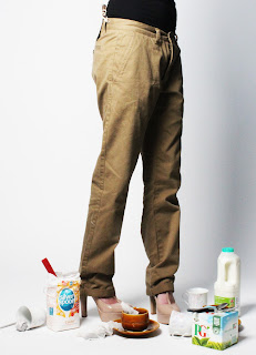
So to start off I was really pleased with how the three shoots went and like I said it really pushed me to get other shoots done during the week and work myself so I would have something to show in this meeting. To get the effects that I wanted I edited all the images on Adobe Photoshop, I wanted to show this to Chris to get his opinion as I tried to create a blur to and change the colours to make the photo look slightly older, to create a feeling of the past. On showing these to Chris he was impressed with the amount that I had done and liked the setting, however he wanted to read the memories as he thought there could be more in the image to make the viewer think about the photo and why things had been put in the image. I totally agreed with what he was saying and with the research that I had done it was true, all the imagery I had looked at had random objects and compositions that could work well with ideas and key words that I had selected from the letters. For the arm chair image we discussed about putting gravy and yorkshire puddings, as well as trying to source an O2 cylinder. I really had my work cut out to create these images and find the right objects to introduce into the still life images.
With my mock up of my first chapter done it seemed to be heading in the right direction, my layout was working well but I had trouble with printing on tracing paper so had to hand draw it for the mean time to show what I wanted to create. One of the things that was picked up on was the shadow in the portraits, it didn't look right.
In the next week I am going to have to re shoot these, even though I was pleased with what I had done it is good having constructive criticism as it will help to make my work the best it can be. This week has pushed me to get on with everything and I feel excited to see it coming together. We also have to present to our tutors next week on all the work that we have done, this will be once again helpful to speak to Chris once I have changed the images that I have done. My only worry is trying to finding this O2 cylinder, I am going to have to phone hospitals and doctors to see if they can lead me one for the a couple of hours if it was allowed to use.
To the left is the image of the other shoot I did. I have copied the image and slightly moved it so it gives it more of a ripple. I have many different angles and and with eyes open and closed so I have a selection I can choose from if I need to change it.
Also below I have added images of the mock up chapter that I showed to Chris.


So to start off I was really pleased with how the three shoots went and like I said it really pushed me to get other shoots done during the week and work myself so I would have something to show in this meeting. To get the effects that I wanted I edited all the images on Adobe Photoshop, I wanted to show this to Chris to get his opinion as I tried to create a blur to and change the colours to make the photo look slightly older, to create a feeling of the past. On showing these to Chris he was impressed with the amount that I had done and liked the setting, however he wanted to read the memories as he thought there could be more in the image to make the viewer think about the photo and why things had been put in the image. I totally agreed with what he was saying and with the research that I had done it was true, all the imagery I had looked at had random objects and compositions that could work well with ideas and key words that I had selected from the letters. For the arm chair image we discussed about putting gravy and yorkshire puddings, as well as trying to source an O2 cylinder. I really had my work cut out to create these images and find the right objects to introduce into the still life images.
With my mock up of my first chapter done it seemed to be heading in the right direction, my layout was working well but I had trouble with printing on tracing paper so had to hand draw it for the mean time to show what I wanted to create. One of the things that was picked up on was the shadow in the portraits, it didn't look right.
In the next week I am going to have to re shoot these, even though I was pleased with what I had done it is good having constructive criticism as it will help to make my work the best it can be. This week has pushed me to get on with everything and I feel excited to see it coming together. We also have to present to our tutors next week on all the work that we have done, this will be once again helpful to speak to Chris once I have changed the images that I have done. My only worry is trying to finding this O2 cylinder, I am going to have to phone hospitals and doctors to see if they can lead me one for the a couple of hours if it was allowed to use.

To the left is the image of the other shoot I did. I have copied the image and slightly moved it so it gives it more of a ripple. I have many different angles and and with eyes open and closed so I have a selection I can choose from if I need to change it.
Also below I have added images of the mock up chapter that I showed to Chris.


Monday 29 April 2013
Photoshop and editing
Now that I have some images for the first few chapters I am able to to do some editing on Adobe Photoshop. So for one of the first memories I was given the description of the person sitting with their legs over the side of an arm chair. This original images where on my last blog, below you can see how I have edited them to create the effect of just the legs over the side. I am going to put this in my draft to show Chris next week, I have also started shooting and collecting some portraits.


As you can see I have used layer and erased the body so that just the legs can be seen. I still need to edit it slightly as I think the lighting is too dark. However, I think I may need to reshoot as the composition isn't quite right, especially with the other chair on the right hand side. But from this I have learnt new skills on Photoshop and how easy it is to use and create really good effects for my images. As well as this it has started me of with improving my photography skills with using the camera and tripod and setting up the location with natural lighting.
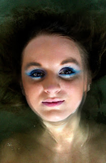
Below are the first portraits that I have shot. From all my research I think it would be best to have them all in black and white and to have the shoulders bare as this give no character to the person in the portrait. The black and white also adds a brilliant effect. I am going to keep playing around and editing images to see what works best alongside the the still life images.


Sunday 28 April 2013
Test Shoots and Still Life
Below are a few shots from the first chapter for my book. I took a few different images of composition so I have many images to chose from when it comes to editing. The first image was one of the first just to test the lighting and to see what was in the images. From this I was able to move things around in the room.
I am pleased with the images but they are slightly dark, hopefully after a bit of editing and colour correction they will be better, if not I may have to re shoot these images. now thatI have got this first shoot under way I can show Chris and see what improvements I need to make to the image. I am looking forward to editing the images and merging them together to make it so you can only see the legs over the arm of the chair. Photoshop is one of my favourite programmes to use and edit on as I am confident on some tricks and tools that it offers.


Friday 26 April 2013
Week 6
I now feel I have done enough research into how I would like to style my book and the photographs within it. I now need to just get on with the concept and put it together. These will be the first photographs I have done since the Guns and Roses logo on the body that didn't really work. I am a bit apprehensive and this is probably why I haven't started getting into the photography. On the other hand, I know once I start doing the image I am going to want continue doing more to complete each chapter.
So to get me going Chris has set me some tasks to complete in the next few weeks. By the 4th of March he wants me to done a few shoots done, so he knows that I have start and I think to help put my mind at rest that I have got under way with the project and that I am not stressing at the end of the project and rushing to get everything done. He also set me to get a mock up of one of my chapters together for the 11th of March, this will include the drawing, still life and potentially the portrait. I say potentially because I am still at a stage where I am unsure on whether I want to include it. However, I think by doing this little mock up it will help me decide on whether I should include them or not. I would like to get this mock up done for next week, to push myself to get this on the go.
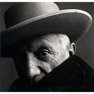
To get me slightly more motivated on doing the portrait Chris has giving me the name Irving Penn to research. Below is just one image I have found so far. I really like the style of work and has made me think a bit more about the style and how this could work within my book.


Penn's still life compositions are skill fully arranged assemblages of food or objects—at once spare and highly-organised, the objects articulate the abstract interplay of line and volume. All of Penn's photographs are composed with a great attention to detail. Penn experimented with many printing techniques, including prints made on aluminium sheets coated with a platinum emulsion rendering the image with a warmth and maturity that untoned silver prints lacked. His black and white prints are notable for their deep contrast, giving them a clean, crisp feel.
So to get me going Chris has set me some tasks to complete in the next few weeks. By the 4th of March he wants me to done a few shoots done, so he knows that I have start and I think to help put my mind at rest that I have got under way with the project and that I am not stressing at the end of the project and rushing to get everything done. He also set me to get a mock up of one of my chapters together for the 11th of March, this will include the drawing, still life and potentially the portrait. I say potentially because I am still at a stage where I am unsure on whether I want to include it. However, I think by doing this little mock up it will help me decide on whether I should include them or not. I would like to get this mock up done for next week, to push myself to get this on the go.
To get me slightly more motivated on doing the portrait Chris has giving me the name Irving Penn to research. Below is just one image I have found so far. I really like the style of work and has made me think a bit more about the style and how this could work within my book.
"A good photograph is one that communicates a fact, touches the heart, and leaves the viewer a changed person for having seen it; it is in one word, effective." —Irving Penn.
Penn was perhaps best known for his fashion photography, but his collection of work also includes portraits of creative greats; photographs from around the world; modernist still lifes of food, bones, bottles, metal, found objects and stunning scenes from travelling.
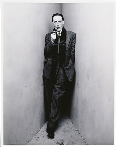
Penn was among the first photographers to pose subjects against a simple grey or white backdrop and used this simplicity more effectively than other photographers. Expanding his studio surroundings, He was able tp constructed a set of upright angled backdrops and acute corner. (as seen above) Subjects photographed with this technique included Martha Graham, Marcel Duchamp, Pablo Picasso, Georgia O'Keeffe, W. H. Auden, Igor Stravinsky.


Penn's still life compositions are skill fully arranged assemblages of food or objects—at once spare and highly-organised, the objects articulate the abstract interplay of line and volume. All of Penn's photographs are composed with a great attention to detail. Penn experimented with many printing techniques, including prints made on aluminium sheets coated with a platinum emulsion rendering the image with a warmth and maturity that untoned silver prints lacked. His black and white prints are notable for their deep contrast, giving them a clean, crisp feel.
While using traditional methods, Penn also ventured beyond creative boundaries. This works perfectly for both my ideas of doing still life and portraiture, if you see this work you are easily able to spot that it is Penn's work. I am hope that the same continuity is shown in my own book, even if the still life images are slightly different, the portraits I create will be a lot easier to make the same. This work has really inspired me in my own creations and how to start organising my still life images.
Guy Bourdin
Guy Louis Bourdin, born December 2, 1928 in Paris was a French fashion photographer. Starting with a year military service in Dakar, it was here where he received his first photography training as a cadet in the French Air Force. Returning to Paris is 1950 Bourdin made his first exhibition of drawings and paintings at Galerie, Rue de la Bourgogne, Paris.
After this his first photographic exhibition was in 1953 and he continued with fashion shoots for
Vogue Paris in 1955 and were published in the February issue, his work continued to appear in the magazine until 1987. An editor of Vogue magazine introduced Bourdin to the shoe designer Charles Jourdan, who became his patron, and Bourdin shot Jourdan's ad campaigns between 1967 and 1981.

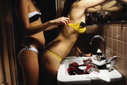 Bourdin's work is quirky and has anthropomorphic compositions were greatly recognised and always greatly anticipated by the media. He one of the best known photographers of fashion and advertising of the second half of the 20th century. He shared Helmut Newton's taste for controversy and stylisation, but Bourdin's formal daring and the narrative power of his images exceeded the bounds of conventional advertising photography. Shattering expectations and questioning boundaries, he set the stage for a new kind of fashion photography. Bourdin worked for Vogue and Harper's Bazaar, and shot ad campaigns for Chanel, Issey Miyake, Emanuel Ungaro, Gianni Versace, Loewe, Pentax and Bloomingdale's.

After this his first photographic exhibition was in 1953 and he continued with fashion shoots for
Vogue Paris in 1955 and were published in the February issue, his work continued to appear in the magazine until 1987. An editor of Vogue magazine introduced Bourdin to the shoe designer Charles Jourdan, who became his patron, and Bourdin shot Jourdan's ad campaigns between 1967 and 1981.
Since his death, Guy Bourdin has been hailed as one of the greatest fashion photographers of all time, and his son Samuel Bourdin released a book with the finest prints of his father's work, called "Exhibit A" in 2001. His work created complex narratives that were sensual, provocative, shocking, exotic, surrealistic, sometimes sinister and simply only touch on the fashion items. Bourdin's strange and mysterious, sometimes violent, sexual, and surreal narratives have possibly been more influential on the younger generations of fashion photographers.
 The reputation of being incredibly demanding and dark rumours surrounded him about the cruelty in which he treated his models but he wasn't a
natural self-promoter, in fact he refused several offers of exhibitions, rejected ideas for books, and wanted his work destroyed after his death, however, mentioned before his brother devoted a book to his ten years after his death.
The reputation of being incredibly demanding and dark rumours surrounded him about the cruelty in which he treated his models but he wasn't anatural self-promoter, in fact he refused several offers of exhibitions, rejected ideas for books, and wanted his work destroyed after his death, however, mentioned before his brother devoted a book to his ten years after his death.
Thursday 25 April 2013
Sally Mann
Back to looking at the portraits which I was unsure about putting in the book, I think it would be a good idea so I have some continuity in the book and I can show some make up skills but by keeping the models all natural looking. So I have done some more research on different photographers, such as Sally Mann.
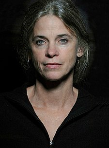 Sally Mann is an American photographer, best known for her large black-and-white photographs, her early career starting with portraits of her young children, then later of landscapes suggesting decay and death.
Being born in Lexington, Virginia, the youngest of three. Mann earned a B.A., summa cum laude, from Hollins College and a MA in creative writing in 1975. However, she took up photography at a younger age where she made her photographic debut at Putney School, with an image of a nude classmate.
Her father encouraged her interest in photography so after graduation, Mann worked as a photographer at Washington and Lee University, photographing the construction of its new law school building. This then sparked the publishing of her first book in 1984, and four years later in 1988 her second book, ‘At Twelve: Portraits of Young Women’ was published. However this stimulated controversy as some of the images captured the confusing emotions and developing identities of adolescent girls expressive printing style lent a dramatic and brooding mood to all of her images.
Best known for her 1992 publication of her Immediate Family. Her third collection has 65 black-and-white photographs of her three children, all under the age of 10. Many of the photographs were taken at the family's remote summer cabin along the river, where the children played in the sun. Most of the images show typical childhood themes such as skinny dipping, dressing up, vamping, napping, playing board games. However, some of the images touch on darker themes such as insecurity, loneliness, injury, sexuality and death. Some of her photography start controversy and even started accusations of child pornography, one image of her 4-year-old daughter was censored by the Wall Street Journal with black bars over her eyes, nipples and pubic area.
Mann said herself that her images were “natural through the eyes of a mother, since she has seen her children in every state: happy, sad, playful, sick, bloodied, angry and even naked.” A book full of spontaneous and care free children, a sort of keepsake for Mann herself of her children growing up.
No on e else has a collection of family photographs is remotely like it, and The New Republic considered it "one of the great photograph books of our time."
After this with her fourth book, Still Time, was based on the catalogue of a traveling exhibition that included more than 20 years of her photography. The 60 images included more photographs of her children, but also earlier landscapes with colour and abstract photographs. Other publications after this concentrated on her work on landscapes. See is currently working on self portraits and intimate images of her family life.
Her work is very controversial and was highly critiqued but her work stands out from other and get noticed. The idea of using children when they are happy and playing and then to change the mood so dramatically.


Being born in Lexington, Virginia, the youngest of three. Mann earned a B.A., summa cum laude, from Hollins College and a MA in creative writing in 1975. However, she took up photography at a younger age where she made her photographic debut at Putney School, with an image of a nude classmate.
Her father encouraged her interest in photography so after graduation, Mann worked as a photographer at Washington and Lee University, photographing the construction of its new law school building. This then sparked the publishing of her first book in 1984, and four years later in 1988 her second book, ‘At Twelve: Portraits of Young Women’ was published. However this stimulated controversy as some of the images captured the confusing emotions and developing identities of adolescent girls expressive printing style lent a dramatic and brooding mood to all of her images.
Mann said herself that her images were “natural through the eyes of a mother, since she has seen her children in every state: happy, sad, playful, sick, bloodied, angry and even naked.” A book full of spontaneous and care free children, a sort of keepsake for Mann herself of her children growing up.
No on e else has a collection of family photographs is remotely like it, and The New Republic considered it "one of the great photograph books of our time."
After this with her fourth book, Still Time, was based on the catalogue of a traveling exhibition that included more than 20 years of her photography. The 60 images included more photographs of her children, but also earlier landscapes with colour and abstract photographs. Other publications after this concentrated on her work on landscapes. See is currently working on self portraits and intimate images of her family life.


Wednesday 24 April 2013
Drawings and tracing paper
As I have already mentioned I am considering doing my own drawings to include in the book. This idea would make it more personal for me and showcase some of my other talents and hobbies. I started drawing images for the photo shoots I was planning on doing at the beginning of the project. So from this idea and re reading the texts I have been given of memories and picking out the key words one for the still life images I am thinking of doing and two I have found object or things I could possibly draw as well.
I need to start doing this drawing as they will only take me about half and hour to and hour to do and will be one section of the book I don't have to worry about once it's done. The only problem I think I am going to have is how I am going to put these images into the book. I have been talking to Chris about maybe putting them on tracing paper or some sort of acetate and have it over the writing that I am going to scan in and have printed on a page.
I need to start looking into where I could get these printed on tracing paper as this is my first choice as it gives it a ghostly feel. As well as this will I have to get it printed separately and then some how incorporate it into the book or is there a publisher that will be able to do it all for me? However if tracing paper is to difficult to print on then I know that I can definitely print on acetate and put it within the book. This something I am going to have research to get what I want. Would mean a lot to get my drawings in the book.
Tuesday 23 April 2013
Old Photographs


Along with collecting the written information, I asked if there was any images of the person they had described just so I could get a better picture of the person and maybe just an insight to their style and living. Above you can see a couple of images I was given. As well as being an insight to the persons life I thought maybe I could some how incorporate these images into my book, by either having a page at the front and back or to break up the chapters. If not I will have to leave them out and make the reader of the book make up their own visual image of the individual.
Sunday 21 April 2013
Collecting Memories
I have researched how we collect our personal memories, however how am I going to collect these memories for my project?
From what I have thought about and researched, I think it would be more personal and interesting if the individual writing the memory found their own piece of paper, whether it be lined, plain or a scrap bit of paper. Doing this could create a style with in the book and each person/chapter then has an individual feel but overall the book will have continuity with the same portraits and style of still life images.
I have asked a selection of friends and family members to write anything from a paragraph to an A4 piece of paper indicating the style on the person, make up and clothing, a location that they are well remembered being in and 5 objects that remind them of the person. This will give me enough information to work from and so I can create an number of different images so that I can pick and choose to get the right image to go with each person and really shows their personality.
I have already received two of these memories, and have been really interesting to read and get to know the lives of these people and to see how others remember them. I have also started picking out the key objects from the letters and putting together the folder of ideas. This concept is working well for me and making it clearer for me to see the chapters of each person come together. My only concern at this point is getting the obscure objects and locations to create the still life images, I plan to start researching and collecting things for each one.
Friday 19 April 2013
Fonts and Layouts
So with my ideas coming together and feeling happier and not so worried about the imagery I am going to put within my book I need to start considering the font and layout that I would like to use.

Above you can you see the some of the fonts that I found on dafont website that I thought would be suitable for my book. I was looking for something that is a bit more old fashioned to compliment the ideas of memories and sort of old. These are only a few that I found and there are plenty more that I need to search, so that I find the best to work well with in my book.
Below is a draft of how I would set out my pages, I needed to do this so I am able to work out the number of pages I am going to have, as well as work out the order that everything is going to be. This has really help sing where I am heading and what I have to work towards, the little things really count to tie the book together so need to be researched and planned.


I have realised the time I have got left and looked at my production schedule I created at the beginning of the project. I need to start completing more of my photo shoots if I am going to get the book ready for when I stated I wanted it to be published so I have enough time to check through and reprint if necessary.

Below is a draft of how I would set out my pages, I needed to do this so I am able to work out the number of pages I am going to have, as well as work out the order that everything is going to be. This has really help sing where I am heading and what I have to work towards, the little things really count to tie the book together so need to be researched and planned.


Tuesday 26 March 2013
Week 5
After a long week of researching and gathering ideas together I feel that I have started to pull the concept and my ideas into something that is strong. Talking to Chris last week I was slightly off track and felt confused in which way my project was heading, so for this weeks lesson I have put together a folder where each wallet has an individuals memory, some photographs of them and some drawings that I have started to create to put within the book. The idea of these drawing came after talking and sharing my ideas with my housemate, I started drawing ideas down for the shoots that I wanted to create. From this, and always having a love for drawing it started the idea of having something more personal from myself that I could include within the book.
Putting this folder together has really helped me see what have for each person and made it clearer, along with drawings and scanned in images I have picked out keywords and objects from the memory I was given so that if I go ahead with this idea of doing a still life and portraits I can easily see the objects and location I need to use for the individual person.
However, the problem that I think I am going to face is finding different object that are rather odd or unusual to put with in the still life images, such as Juke boxes, old televisions and pianos. None of these are easily available and certainly not always going to be in the right location in which I am hoping to shoot the images in. So for next week I am going to start phoning different place to see if I can shoot in locations or if people can help me out with the obscure object I am going to need.
Other things I have to consider after to talking to Chirs is how am I going to display my drawings and what are the drawing going to be of? We discussed about maybe printing the drawings onto tracing paper or acetate so they are transparent and you can either see the portrait, still life or maybe putting a snippet of the letters that were given to me in the first place. This idea of making it see through or partially see through gives it a ghostly feel which ties into the concept of it being a book on lost loved ones or friends that have past away. This is only one part of the chapter for each person I need to continue researching in different layouts in which could influence the way in which I layout my book, I plan on going to the library to look at the photography and fashion section and particularly looking at some of the photographers and artist I have previously researched and new ones such as Sally Mann and Guy Bourdin.
I feel as if I have plenty to do in the next week, researching ideas and continue doing drawings.
Juergen Teller
So after looking at the work of Kander for my portraits in my book, I thought it would be a good idea to research some photographers for the still life work I am hoping to create. I need some inspiration of how to make my work stand out.
One influence comes from, Juergen Teller a fashion photographer and artist who was born in Germany who at the age of 22 moved to London. However before moving he studied at the Bayerische Staatslehranstalt für Photographie in Munich.
One influence comes from, Juergen Teller a fashion photographer and artist who was born in Germany who at the age of 22 moved to London. However before moving he studied at the Bayerische Staatslehranstalt für Photographie in Munich.
Since being in London Teller’s fashion photography work has been featured in books, magazines or exhibitions, including The Face, Vogue (US, France, England, Italy), Another Magazine, Index, W Magazine, Self Service, Details, Purple, i-D and 032c, among others. Many of his pieces of work he prefers to have in colour, and regularly includes himself in his photographs. Below you can see one image that includes himself in the background, the image on the right hand side is Kristen McMenemy taken in 1996.


Gaining wider recognition in 1996 from the photo above, he then began collaborating with Marc Jacobs in 1997. since this Teller has shot campaigns for the brand and the 2005 campaign, he photographed himself with Cindy Sherman. Other collaborations for Marc Jacobs campaigns involved, among others, Winona Ryder, Sofia Coppola, Charlotte Rampling, Michael Stipe, Rufus Wainwright, Harmony Korine, and Roni Horn.

Teller has also had long collaborations with other designers and fashion houses over the years including Helmut Lang, Yves Saint Laurent (since 2005), Vivienne Westwood. He has recently collaborated with Céline. He frequently works with the musician Björk. Teller has also photographed many artists, including William Eggleston and Roni Horn.
It goes without saying that he is regarded as one of the most influential fashion photographers working today. His work inspires me to create some risky and controversial still life imagery by picking out the main points. So from this I am going to organise a scrap book together of all the letters I have received of memories, photographs and drawings, this firstly give me a clearer view of what I need to plan to do as well as having each chapter/person separate to start bringing ideas together and organising what photo shoots I need to start putting together.


Nadav Kander
Nadav Kander is a London based photographer, artist and director, and particularly known for his portraiture and landscapes and began taking pictures when he was 13 on a Pentax camera. A lot of his later work is included in the collections of the National Portrait Gallery, the Victoria and Albert Museum and other galleries and museums. After being drafted into the South African with his parent and going into the Air Force, Kander worked in a darkroom printing aerial photographs but moved to London in 1986.
One of Kander's most celebrated images is his 2009 portrait of Barack Obama photographed for The New York Times Magazine as a cover feature. Below you can see one of the images of Obama and Sir Ian McKellen.
One of Kander's most celebrated images is his 2009 portrait of Barack Obama photographed for The New York Times Magazine as a cover feature. Below you can see one of the images of Obama and Sir Ian McKellen.

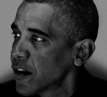
On 18 January 2009 Nadav Kander had 52 full page colour portraits published in one issue of The New York Times Magazine. These portraits (from a series titled Obama's People) were of the people surrounding President Barack Obama, from Joe Biden (Vice President) to Eugene Kang (Special Assistant to The President). The same issue also included a series of cityscapes of Washington DC also taken by Kander. This is the largest portfolio of work by the same photographer The New York Times Magazine has ever showcased in one single issue.

As you can see above is some of the portraits that Kander has photogrpahed, these images particularly interest me and are something I am looking at in putting along side the still life images in my book. Putting portraits within the book will add some continuity and hopefully showcase my make up skills. The other reason for looking at Kander is looking at his style of portrait, how he uses lighting as well as using black and white to create mood. From looking at the portraits it is clear to see that it is Kander's work, moving on with my work I hope to do some test shoots for my portraits so I can see what works for me and start my own style to put in the book.
Subscribe to:
Posts (Atom)